Noto Sans Nüshu, type design with multiple unknowns
- Category
- Article
- Year
- 2020
- Client
- Google Fonts
The beginning
This project started with a proposal from the Google Fonts team back in 2019, asking for an adaptation of Nüshu script to be part of Noto Sans, their typeface that aims to cover every single script existing in the Unicode standard 1.
Unlike Chinese characters that work on an ideographic system, Nüshu are syllabic characters, and they transcribe the local dialect spoken in Jiangyong city and its surrounding villages.
Challenges for the design phase started to pile up quickly during the research and exploration phase. First, there are only very few experimentations and attempts in digitizing Nüshu script. Then, they are no references at all about how to design the glyphs (Nüshu never made it in the printing phase, let alone the digital era). And, books or content about the script are only in Chinese and published in China (some articles on the web exist, and in English, but between the myths, theories and other stories, it is hard to sort out reality from imagination).
The issue(s)
For a type designer, some methods are used to find your way in a script that one may not be familiar with it. The principal one may be to find as many references as possible to learn from, whether it is from books, websites, exhibitions (maybe)... and most importantly, experts and native users.
Limited presence of Nüshu
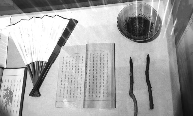
All along its history, Nüshu kept being written by women in Jiangyong, by hands or on many sorts of small-size objects, for texts and words shared within intimate circles. These factors didn’t bring Nüshu script to the (average) typographic development and evolution like most scripts: there was no printed material, thus no wood or metal types with Nüshu characters were ever created. So, there were no specimens or printed samples to be found. Since the digital era started, no fonts have ever contained Nüshu glyphs. The 396 Nüshu glyphs have been added to the Unicode Standard charts only in 2017 2!
For motivated hearts only
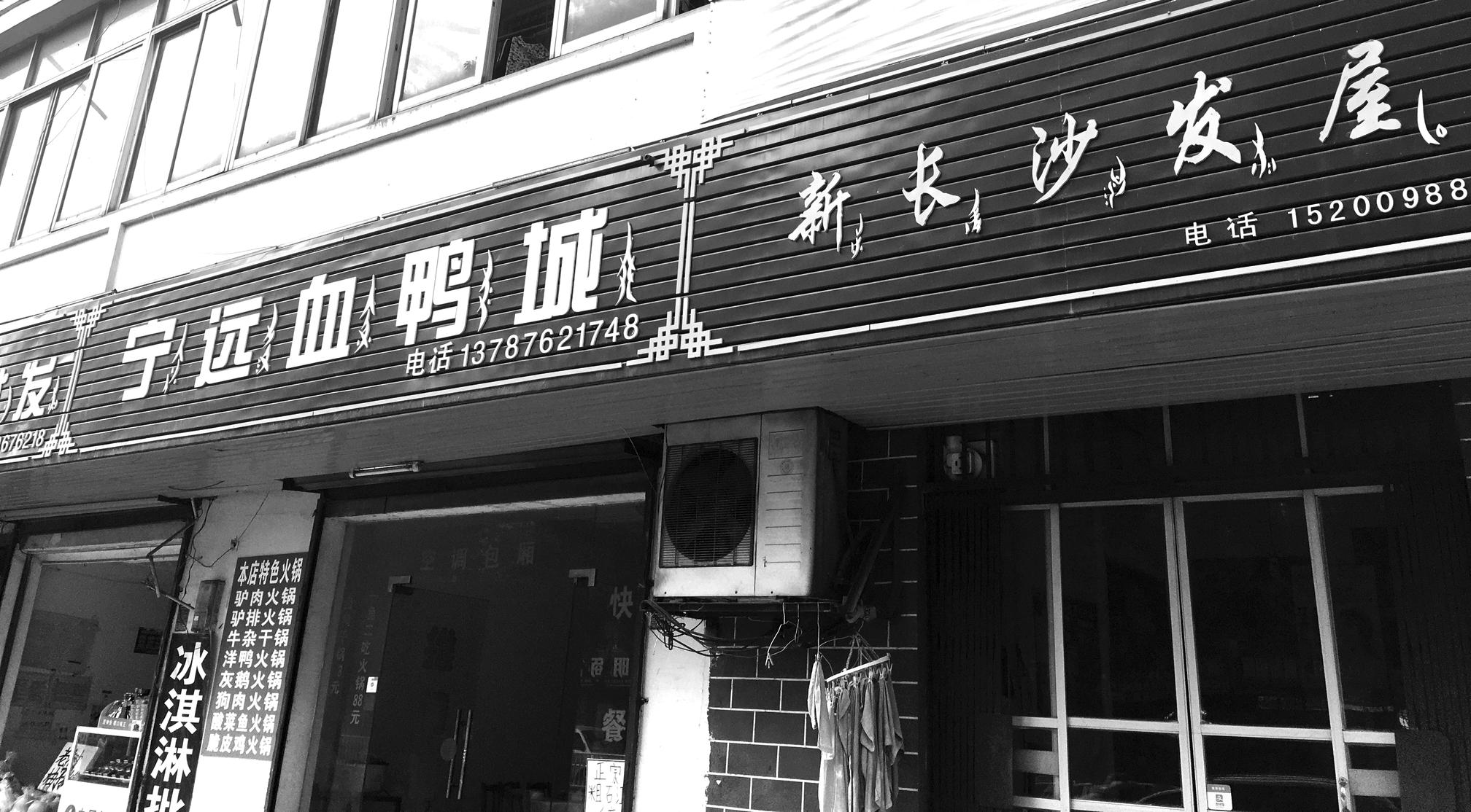
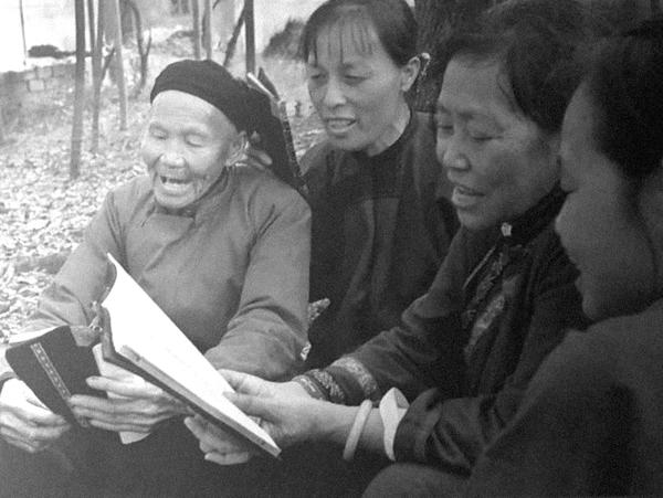
Today, even with great efforts in advertising and sharing about the script, it is still considered as an endangered script. The number of living users is low, and the official language — Mandarin, with the Hanzi script — is largely more used than the local dialect and Nüshu script. Plus, because it is a script created and used by women, the local male population doesn’t have much interest in Nüshu than its commercial and tourist potential. Writing Nüshu script is being taught to everyone who is interested, for free, but knowledge in Chinese is needed. All of these factors create an environment where Nüshu script may be accessible, but not easily…
To be handled with care
Any material about Nüshu script that exists so far talks about the script from a historical, anthropological or linguistic point of view. And not even quite precisely, as the script is little known (even in China) and the few academics or experts on the topic are not natives of Jiangyong. The lack of access to Nüshu script created a kind of mysterious aura around it, with stories and legends of all sorts, appropriation by people who don’t pay enough (or at all) understanding, distorting the truth of Nüshu.
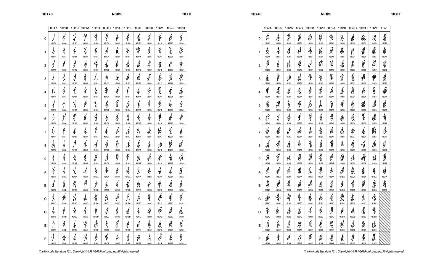
The only possible reference so far: Nüshu in Unicode charts
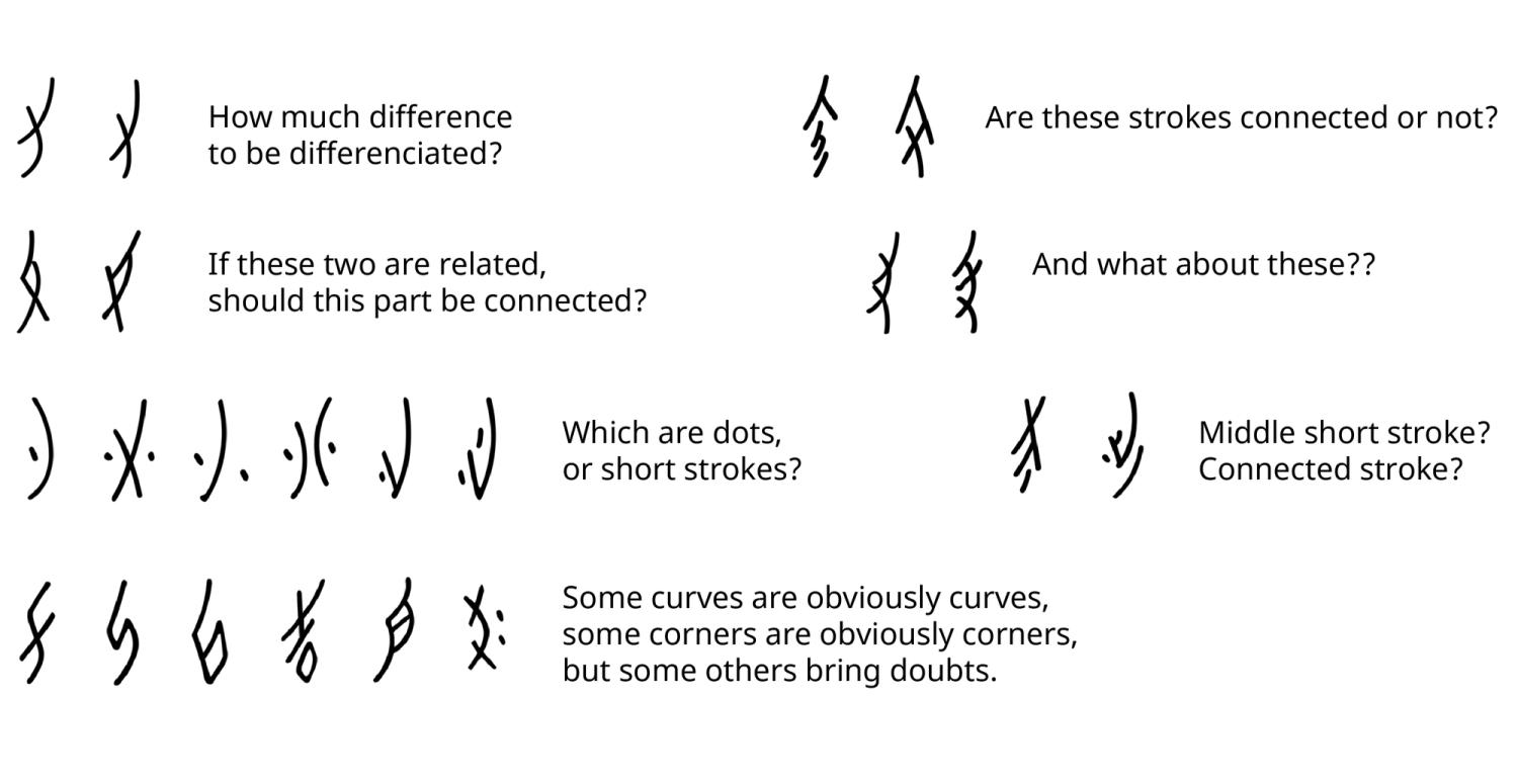
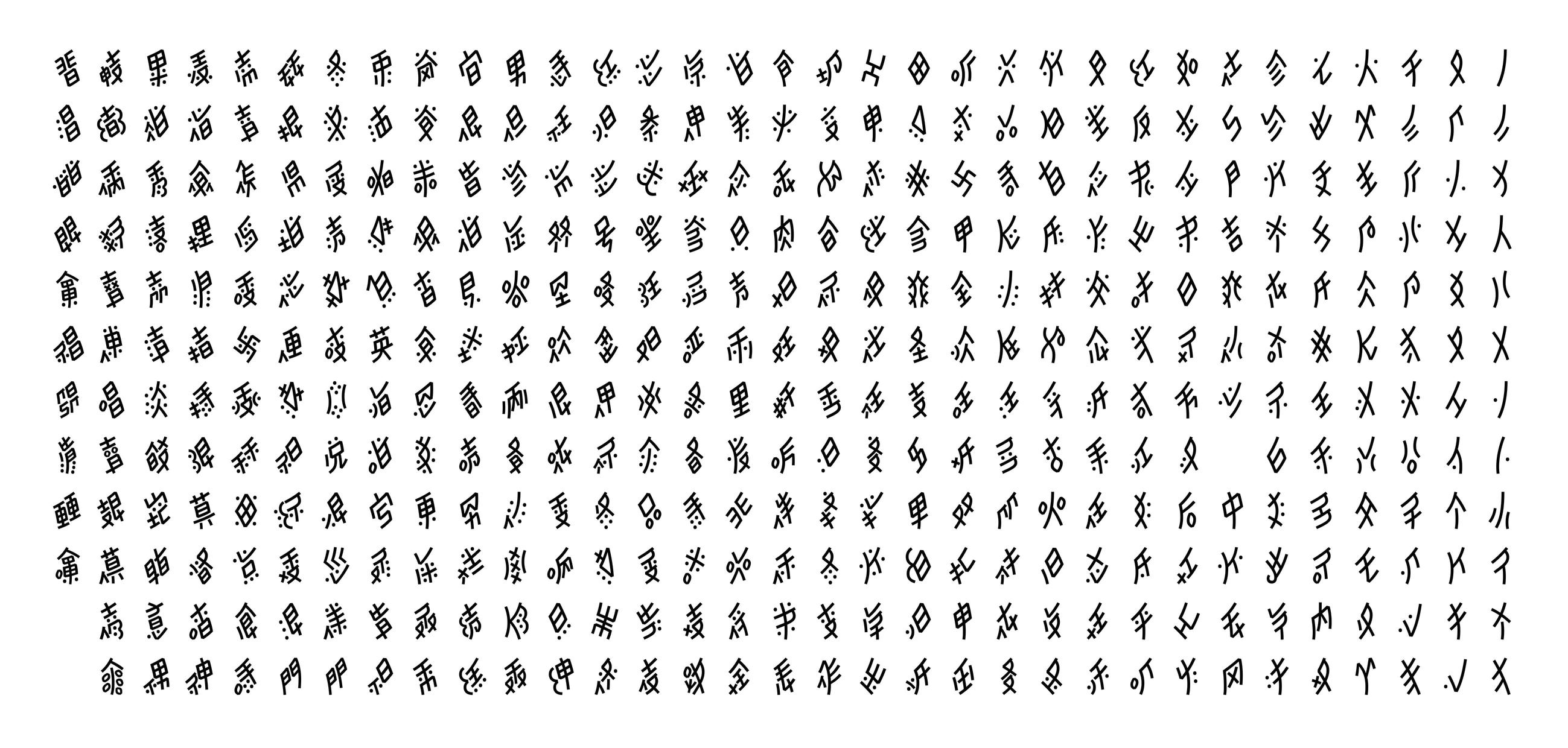
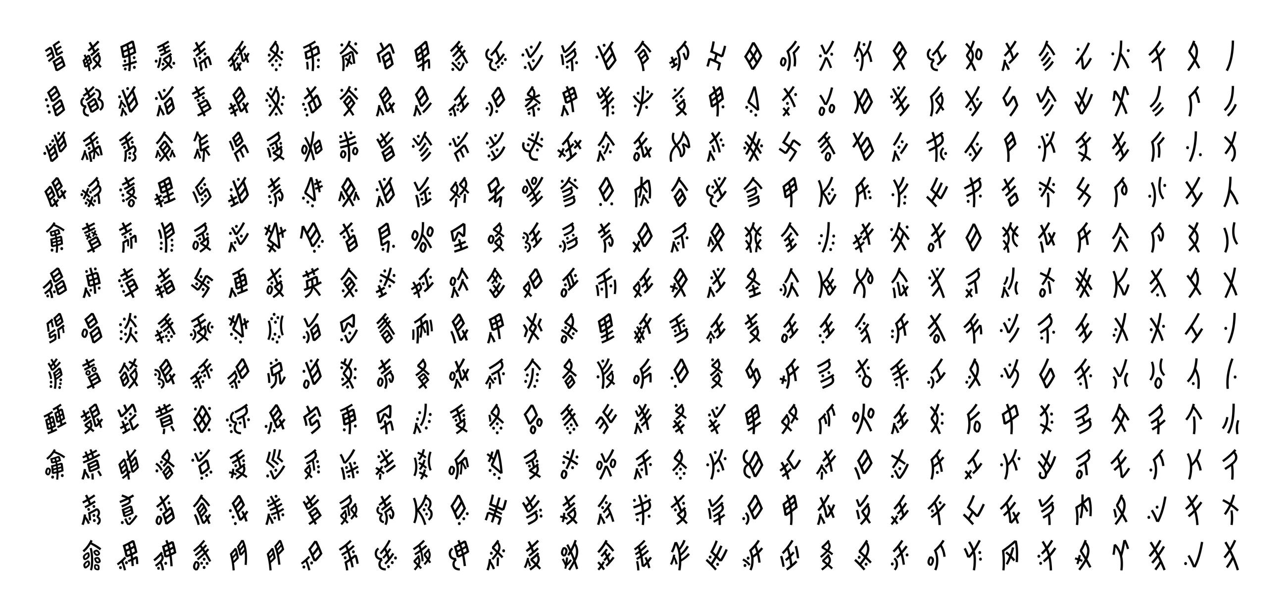
The Unicode chart with Nüshu glyphs could be considered as a reference at least for the job for Noto Sans. It is a list of 396 glyphs selected out of considerable research led by Pr Liming Zhao at Tsinghua University in Beijing 3. But the current chart is with scanned handwritten characters. To a type designer’s eye, they are full of unclear details: strokes too close together, corners that look opened but maybe shouldn’t, connections of strokes inconsistent across very similar glyphs, and so on. When questions were presented to Pr Zhao, such as how to handle details at such a level of precision, she advised to lead a different “study”, with a type designer’s perspective, which doesn’t really need to be a specialist in Nüshu or even learn the language.
The Plan
That study began with online research, a plan for a trip to China to meet people and collect as much material as possible. Then, from all that has been gathered and learned on place, go back to Paris and put it all in place and order, ready for the type design phase. Sounds doable, even for a humble type designer, isn’t it?
Trip to Nüshu’s motherland
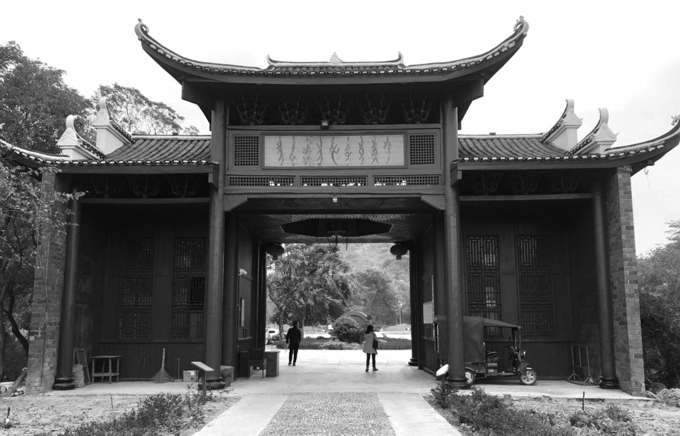
Material was too scarce to be found in Paris, even from the French National Library (BnF) known as one of the world’s largest book collections. So, it made a lot of sense to plan for a trip to where Nüshu has been created, developed, and is still in use today: Jiangyong district, Hunan region, China. As the motherland of Nüshu script, there is a museum fully dedicated to the script, with not only exhibitions of everything around Nüshu and its culture for tourists and other scholars, but it is also where most inheritors of Nüshu culture work actively today. There are free Nüshu classes held every summer for the locals to keep the script alive, and for anyone who is interested in it. And it is widely managed by women, of course.
Collecting data
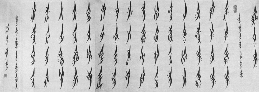
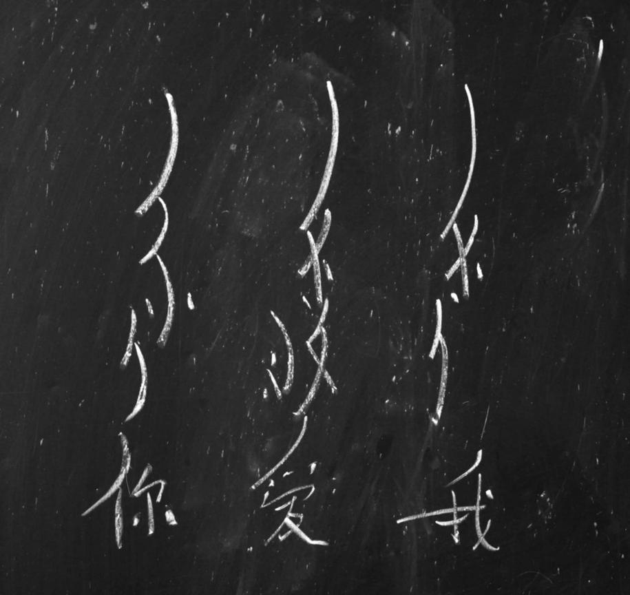
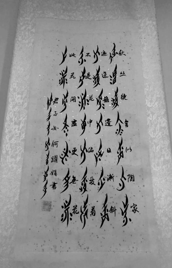
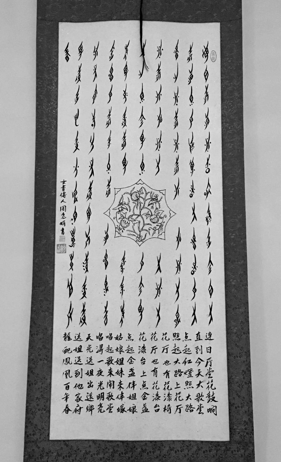
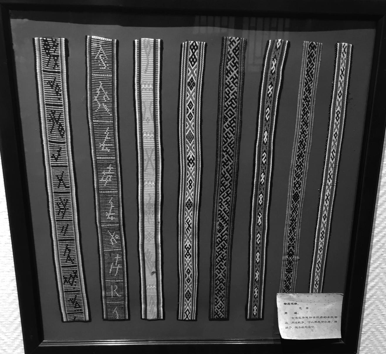
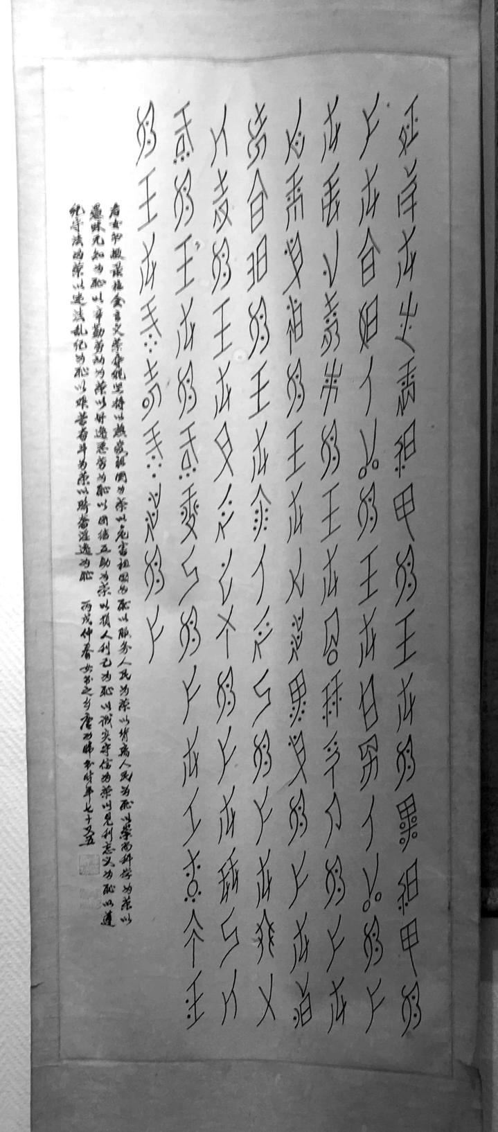
Collecting as much material as possible gave a broad vision of the culture and much diversity in how it lived and lives: nationally and locally published books, photos of notes and booklets, calligraphies of different styles,...
Momentarily pseudo-linguist researcher
Method is key to not getting lost, or at least having a hint on where to begin. Nüshu has been taught with no standard school environment, and from older female generations to younger ones, mostly within the close family circle. That is kind of part of what makes Nüshu Nüshu. So, in a way, without standardized teaching, women had more freedom to add personal preferences to how they write their own Nüshu characters while still keeping their writing legible. Which is great from the script’s point of view, but a true puzzle for a type designer.
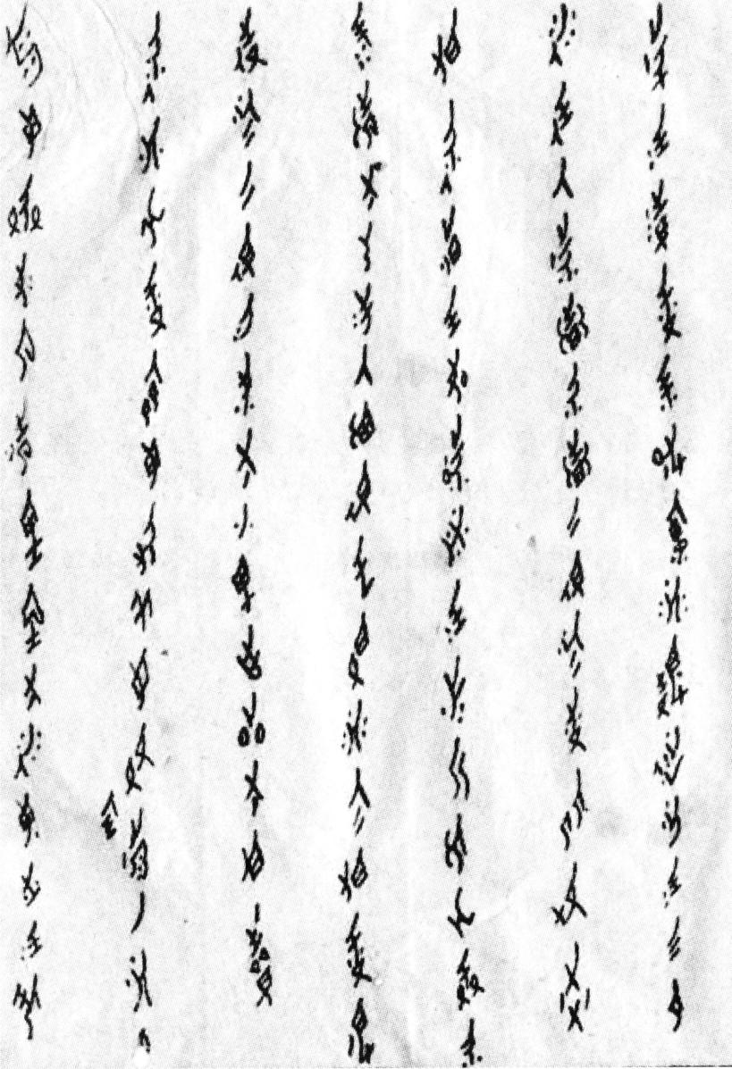
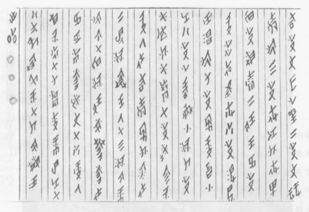
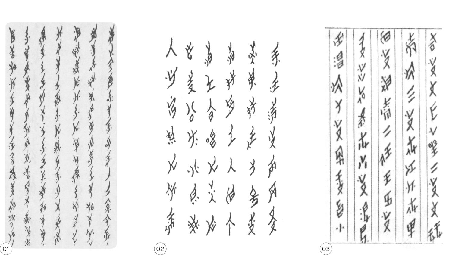
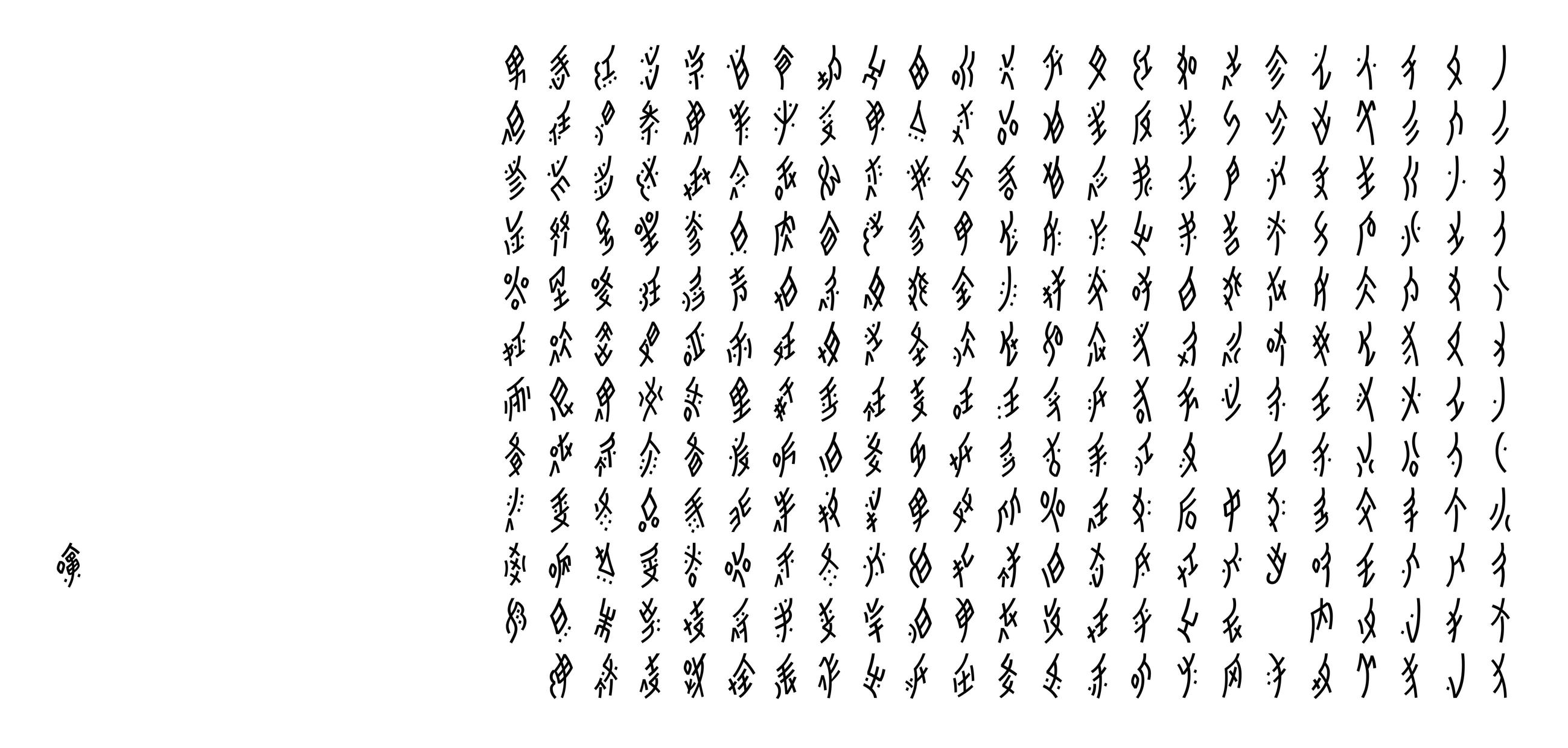
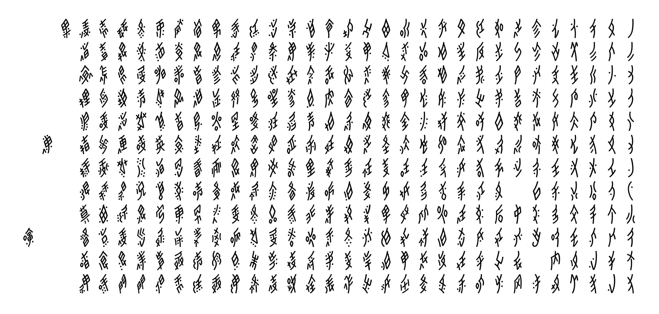
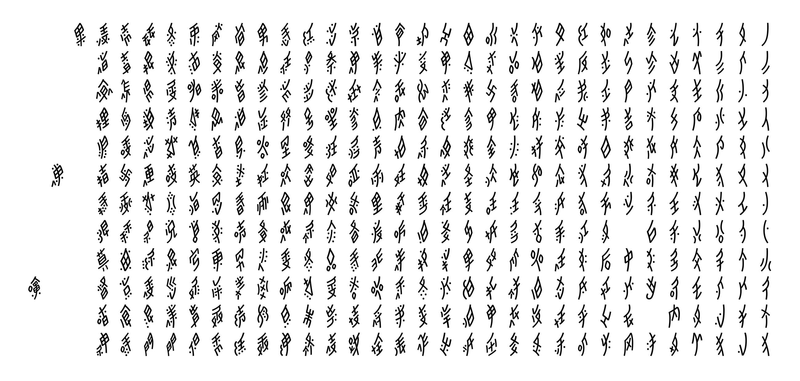
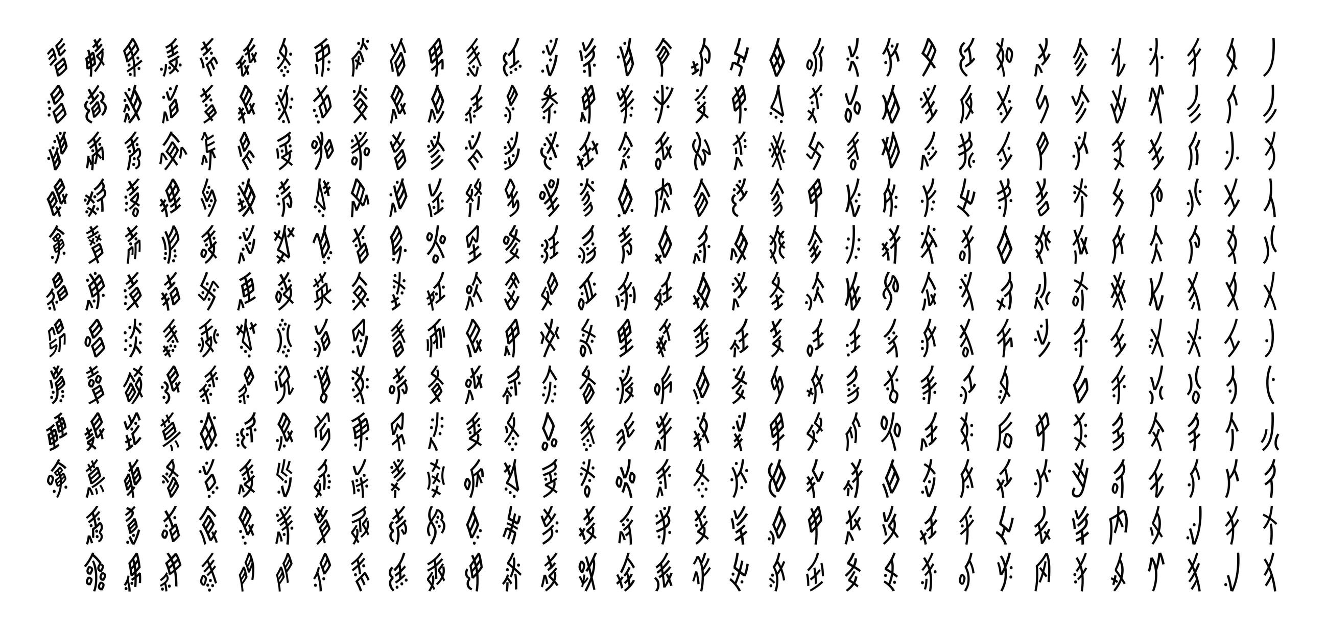
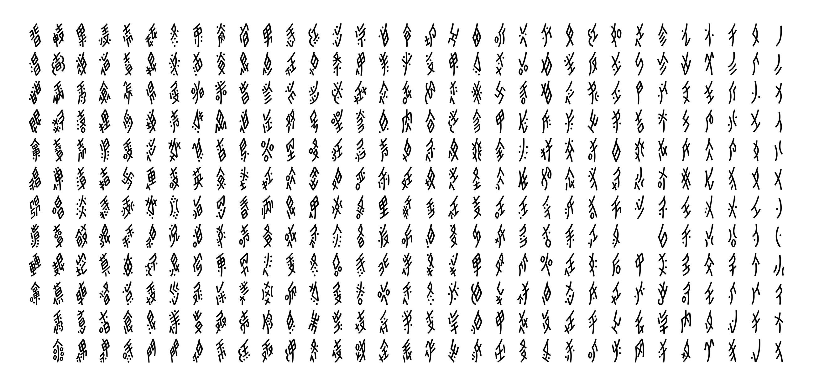
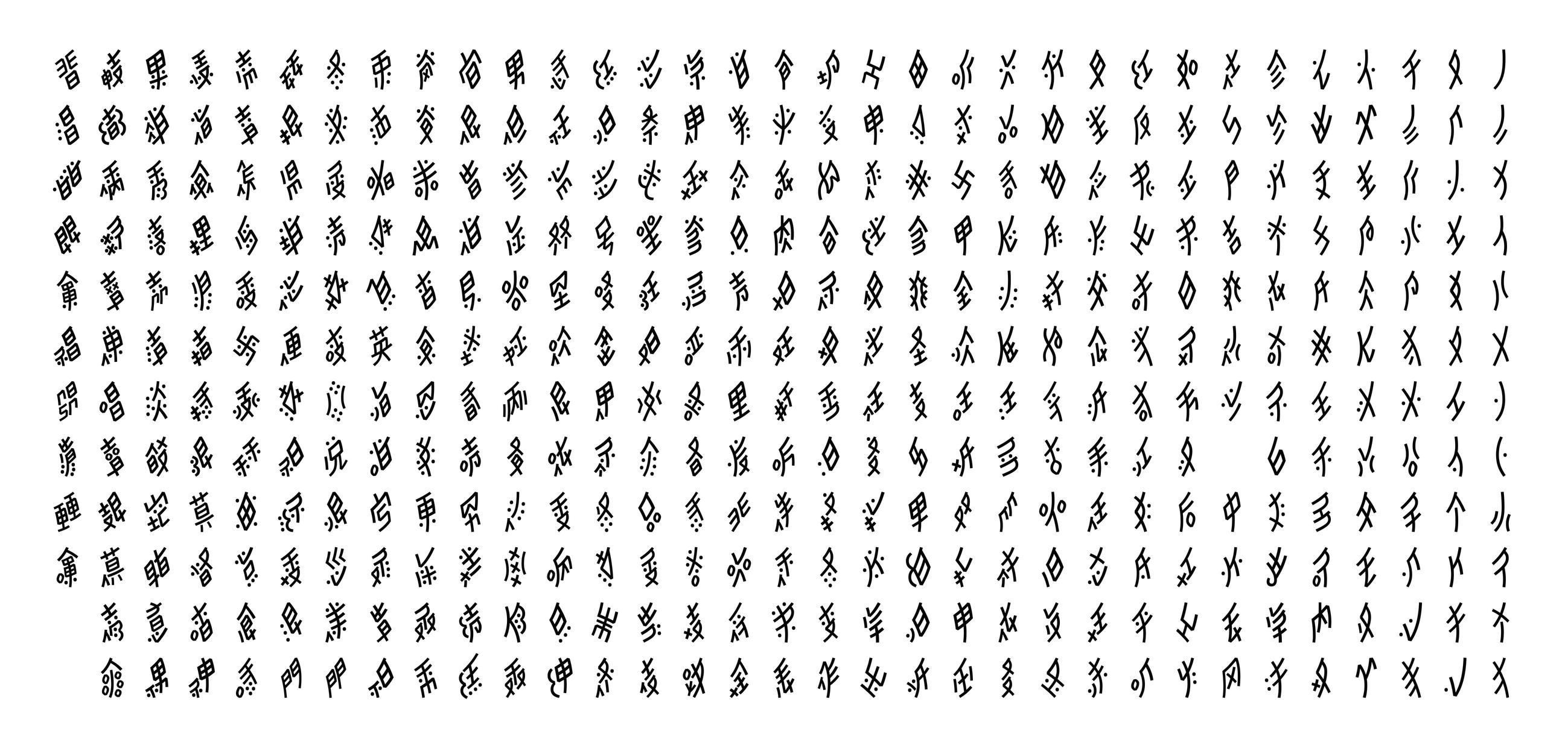
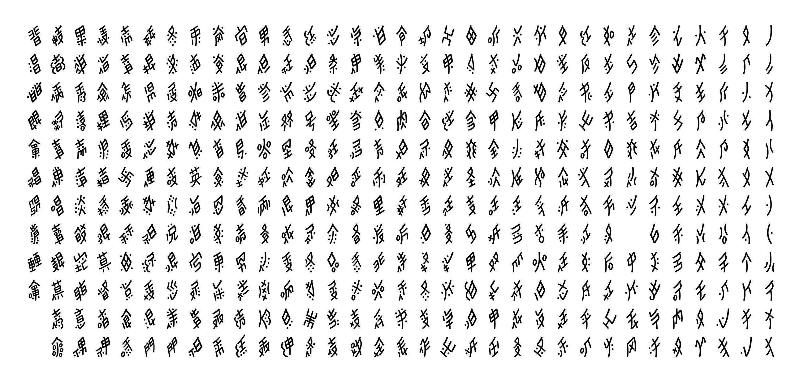
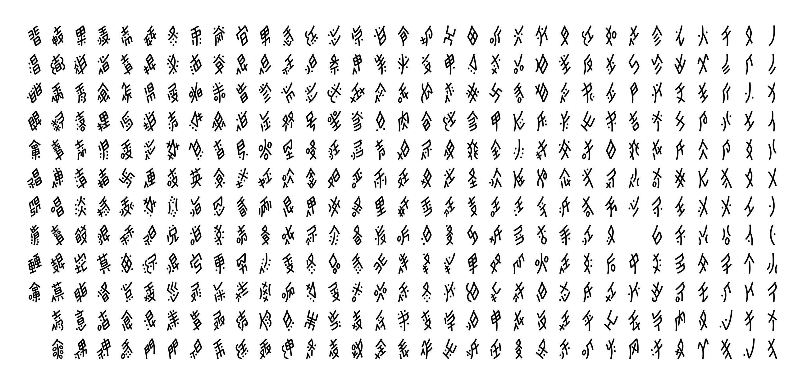
The process was about sorting glyphs out in multiple steps. It is a crucial step to do in order to understand the ductus and glyphs that are (visually) related to one another and which shapes are to be considered as exceptions or more standard. It is similar to knowing that, in Latin, the (upright) letter “n” is built with two separate strokes and that it is closely related to other letters such as “m”,“ h”, “u”, and so on. Here you can find the resulting tables:
- Nüshu written glyphs sorted by glyphs, from multiple authors (please send an email to ask me for the document, it is a large file)
- Nüshu written glyphs sorted by similar shapes and categories (with Unicode chart samples)
- Nüshu written glyphs sorted by similar shapes and categories (with Noto Sans Nüshu font)
Design, finally!
Once the sorting work has been done, imagining how it could be designed as a digital typeface was may much easier. But, another challenge is that it had to match the style of an already existing typeface, Noto Sans, with an already defined brief (even if it’s a rather generic one, according to Google Fonts Noto Sans page: “unmodulated sans serif for texts” 4. So, Noto Sans Nüshu had to find its way not only as a digital form of a script that lived as handwritten texts only so far but also as a digital font with not-so-specific-but-still specifications, without losing the very nature of Nüshu script.
The first step to breaking down each layer of that issue was to find coherent proportions for Noto Sans Nüshu with its Latin letters and Chinese Hanzi, and coherent spacing and metrics even though each of these scripts has fundamentally different typesetting systems.
Latin script is written horizontally, same as modern Chinese Hanzi. But Nüshu has always been written vertically, which gives its particular elongated proportions. So the frame in which Latin letters (rectangles of various widths) or even Hanzi characters (unique square for all Hanzi) are set in is radically different from that of Nüshu glyphs: these are set in lozenges.
And because they were only handwritten, no one has ever determined any guidelines (equivalent of ascenders, descenders,…) for all glyphs. It was all about the visual balance. So there are quite large differences in proportions from one glyph to another, even in the same line of text.
Those proportions were deducted from tests and comparisons with and without Latin and Chinese, as a result of a balance between mechanization of Nüshu script but not too much, to keep as much Nüshu-ness as possible even in this sans serif typeface.
Then, once the ductus of each glyph became more obvious thanks to the sorting results, it got possible to work on smaller and smaller details in the good old type design manner, such as:
- strokes’ thickness for the color to match with Noto’s Regular weight, strokes’ curvature (Nüshu is mainly built with curves and dots) and their terminals;
- their length proportions with each part of the glyph;
- the shape of joints and connecting strokes
- and so on...


Designing a typeface with such neutral features from so fewer information is complex. But thanks to the opinions given by the women from the Nüshu museum and Pr Zhao Liming, Noto Sans Nüshu got to a somewhat close-to-done phase. Based on reading impressions and familiarity rather than type designers’ nit-picking opinions on curvature or corner’s angle, they got to validate these shapes as mechanical and digital shapes.
Again, there is no experience of seeing Nüshu glyphs as a typeface. So it would be better to humbly consider Noto Sans Nüshu as one of the experiments with Nüshu script today. It is only the very beginning of Nüshu script’s journey into the digital world.

What’s next?
As of today, another bigger issue is that there is no implementation system allowing typing Nüshu glyphs with a keyboard yet. If that ever happens (and most definitely should), it would bring Nüshu into the digital realm for sure, as people would actually be able to use it in digital texts, messages, emails and so on. But because Nüshu is a script with a small number of users, it may not catch enough interest from larger firms that could make such a thing happen, and we can only hope that some individuals may eventually figure that out.
On another side, we could also hope for more typefaces with Nüshu, more variety of weights or contrast, designed by actual users who would maybe even bring new forms, new styles to Nüshu script!
In parallel to Noto Sans Nüshu, there is also Noto Traditional Nüshu, designed by Pr Zhao Liu and her team, with a larger glyphset.
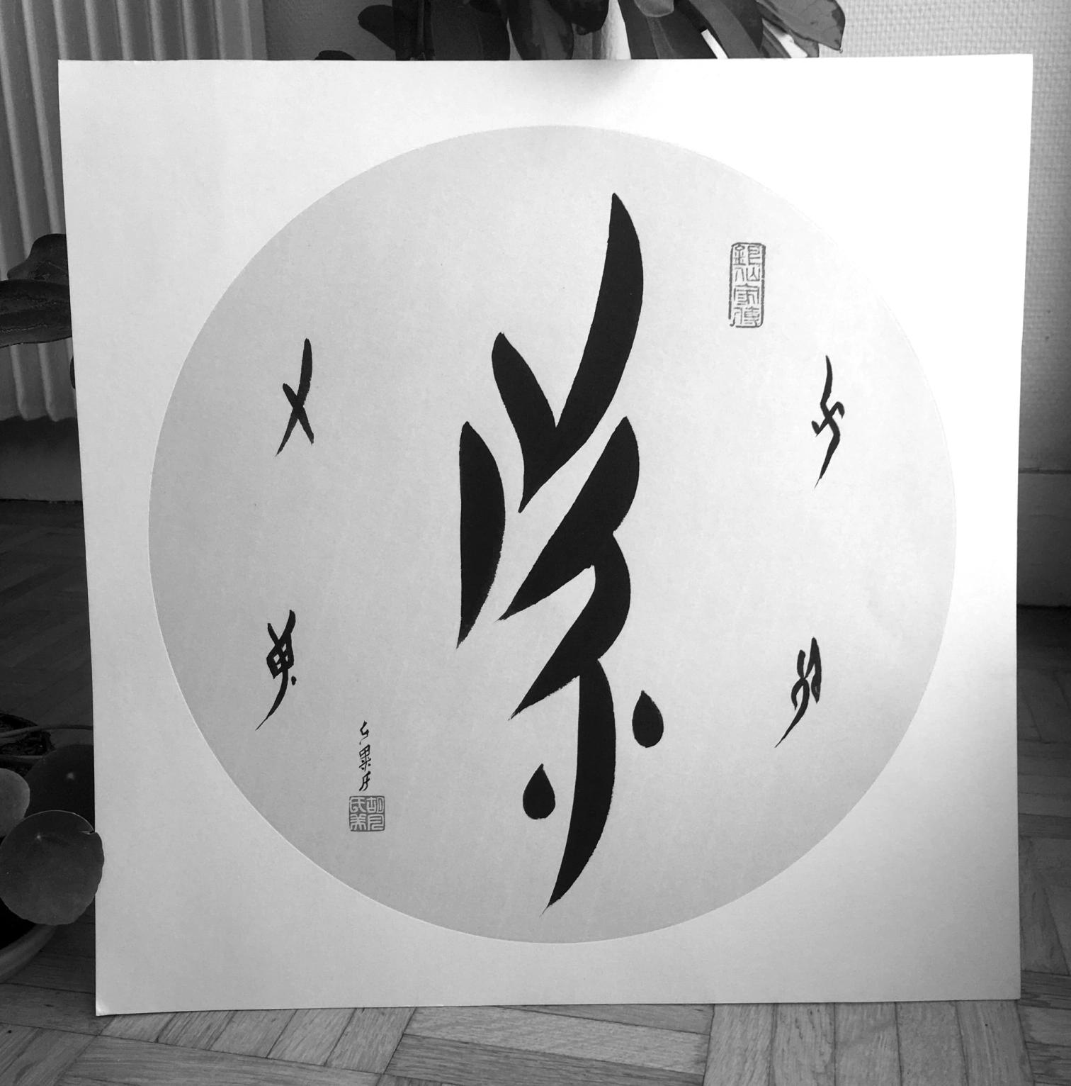
Thumbnail calligraphy by Lijuan Pu (蒲丽娟).
Articles:
- Remembering Nüshu, the 19th-Century Chinese Script Only Women Could Write, by Lauren Young, Atlas Obscura.
- Nüshu, from tears to sunshine, by Chen Xiaorong, Unesco.
Videos:
- Nüshu: A Script for Women, Showcase short documentary.
- Nu Shu: the Secret Songs of Women, by Tan Dun (extract).
Websites:
- 传奇女书 - 清华大学中国古文字艺术研究中心 (Chinese website)
- Online Nushu Dictionary (English and Chinese)
People:
- Pr Liming Zhao (赵丽明)
Professor (now retired) of Ancient Chinese languages at Tsinghua University in Beijing, China. - Dr Zhao Liu (刘钊)
Associate Professor at Central Academy of Fine Arts in Beijing, China. - Pr Orie Endō
Professor in the Department of Cultural Linguistics at the Koshigaya Campus of Bunkyō University in Tokyo, Japan. - Meiyue Hu (胡美月)
Teacher of Nüshu classes at Nüshu Museum in Jiangyong, China.